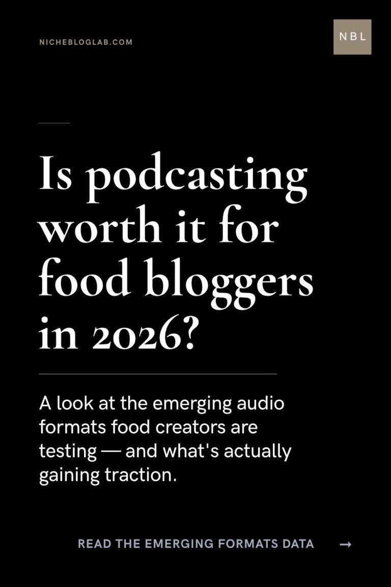
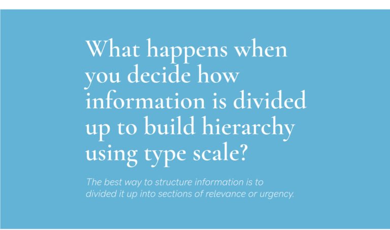
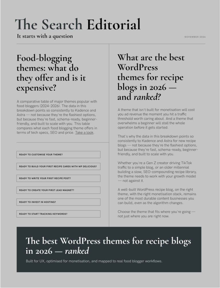
Typescale set: Newspaper layout inspo for a blog archive
Today’s typographic layout draws inspiration from newspaper and editorial design.
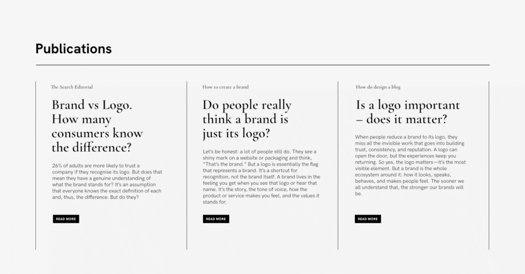
The type hierarchy was created from the typescale tool set below.
Website content block: 1200 x 576px
Using the typescale tool:
Headline: 31.4pt
Body Copy: 12pt
Fine Print: 7.4pt
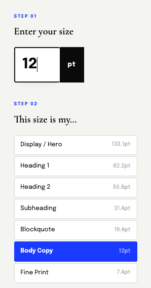
I started with the body copy knowing it had to be the most legible. The headline would be visible and read at any size because that’s the natural hierarchy of information.
The size of the button’s copy didn’t bother me either. I knew if the size down from the body was too small, I could always make it the same as the body copy.
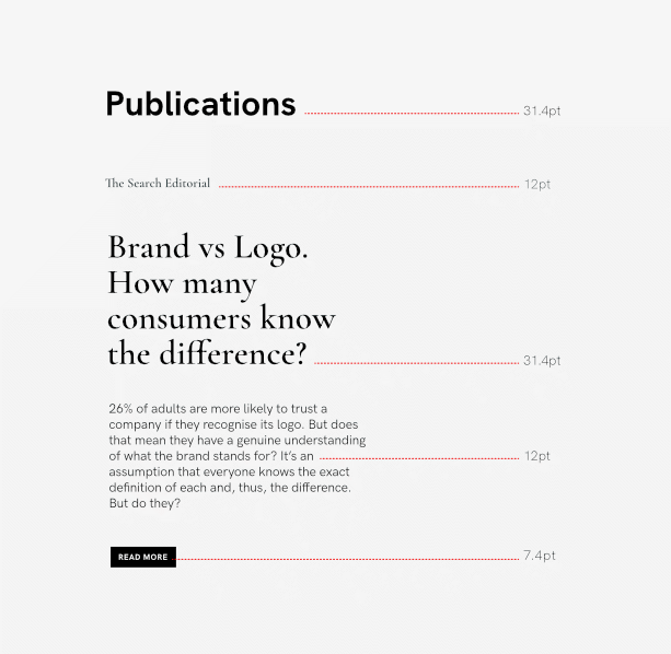
Why the body copy – isn’t it the headline’s job to convert the reader?
The headline is the hero. But, that excerpt gives the reader a taste of what’s inside the article/blog post.
It’s the writer’s job to be clever, engaging or persuasive with the headline or call-to-action copy. However, the body copy isn’t meant to be clever per se – users just want to know what’s coming next. So, the more crisp and legible those few first lines of copy are, the better the UX.
Designer’s tip: The legibility of type is your job – the typographic design has to facilitate the communication, ie. to convey the meaning and purpose of the content as clearly as possible. Ensure the reader is receiving (viewing) that information in the way it was intentioned by the creator (strategy) .
For an archive layout, especially on a landing page I recommend making your focus the body copy. Input that value first into the typescale tool and work upward or downward from there.
The size of body copy will vary depending on the template you’re using, the page width you’ve set.

Designer’s tip: Take a look at the publication names – it’s in the same size as the body copy. Do you think it would have looked better in uppercase or title case? Would it have changed the order of importance? In other words, if it was a larger type size, would it have taken emphasis off the body copy?