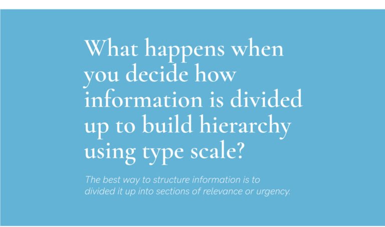
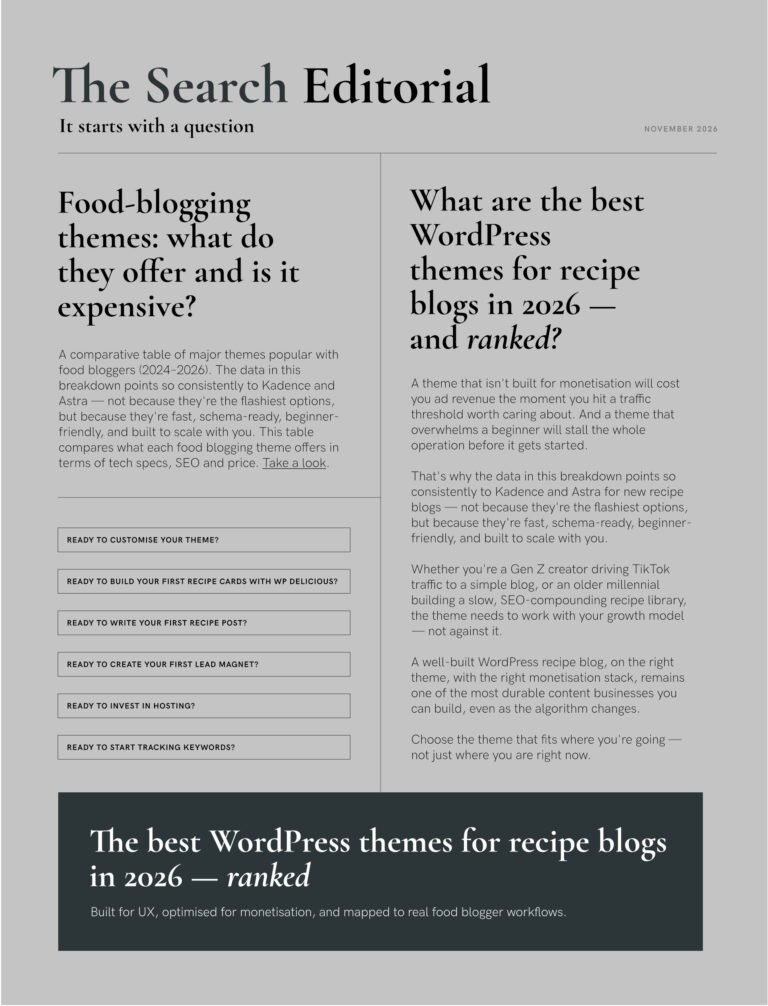
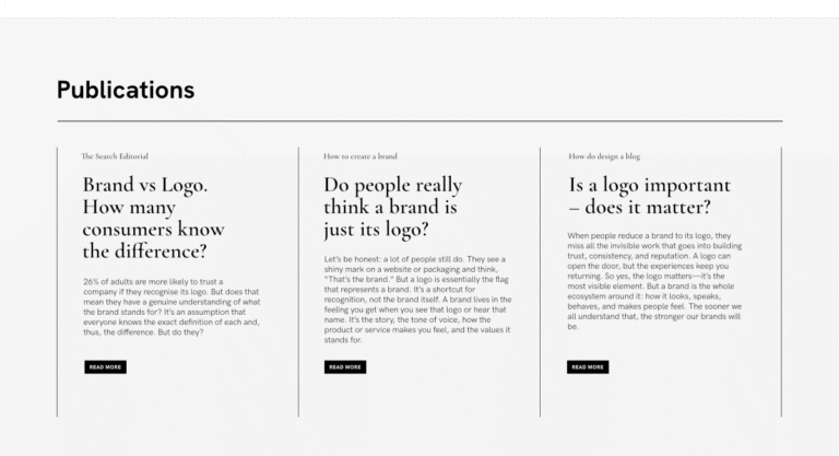
Typescale set and font pairing of the day: Cormorant Garamond + Hanken Grotesk
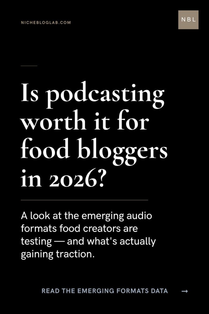
Today’s font pairing and typescale set uses familiar weighting contrasting with small body copy to create balance in a small Pinterest pin layout.
‘Too large’ type design might feel overwhelming and quite frankly, there’s no space here. Take a note out from this approach when creating books, manuals or multi-page brochures. A well balanced set of sizes will ensure legibility and ease of reading for sure.
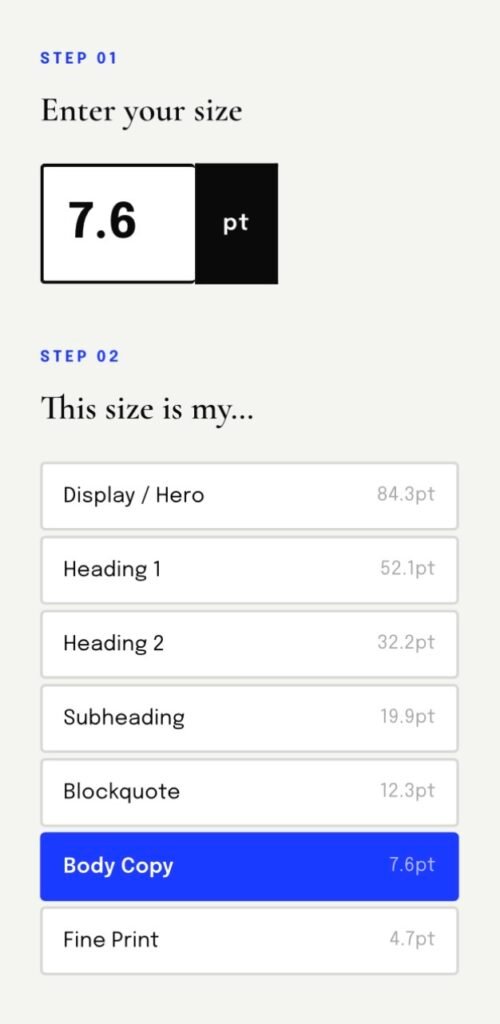
But, for us designer’s, having a set of pre-calculated sizes at the ready is a good way of structuring information easily without getting ‘bogged’ down with crafting individual lines of text at the same time. It frees up time for you to explore the most crucial aspect of design, ie. deciding what needs to be seen and what doesn’t.
Designer’s tip: It might not apply to PPT and PDF decks because the user experiences it different. The tool will be helpful to get a set of sizes, but which text (information) you apply it to, will be discretionary and will your challenge.
NOTE: THIS PINTEREST PIN WAS DESIGNED AS PART OF THE CONTENT MARKETING TACTICS FOR NICHEBLOGLAB.COM