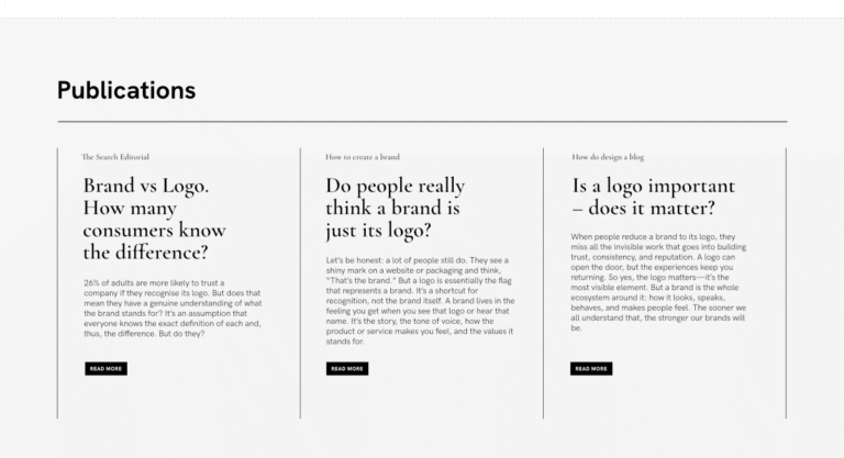
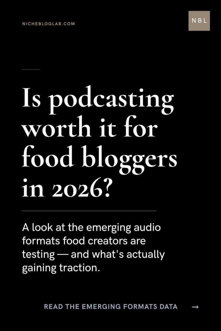
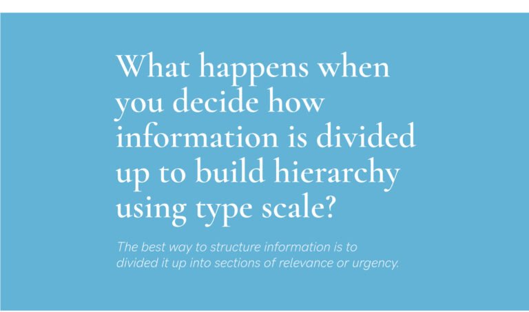
Designing the structure of information – Newsletter layout using a type scale set.
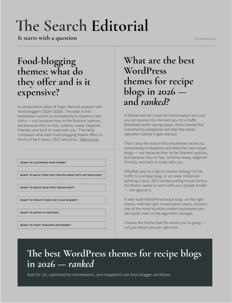
Inspired by newspapers again – not only through font pairings but for designing the structure of information.
Designing the structure of information using automated type scaling
Here’s the type scale set from the tool.
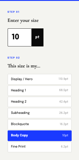
Can you guess the sizes of the other texts in my layout?
- Headline
- Call-to-action button text
- The fine print in the footer banner
- The date
- The tagline
- The masthead title
A designer’s thinking process: Does capitalisation (case) affect which size we choose? Does it make the copy less easy to read? Do we need to make it a point/px/rem size bigger when words are in caps?
Or does it depend on the meaning of the information?
For instance, in this layout I have buttons for related information. Can you guess which size I chose for it because it’s additional information or call-to-action that navigate away from the newsletter?
If you like this, you’ll want to know about hierarchy too.